Motion-design storyboards for voice-over clips
grafika-directorFREEvideomotion
Turns timed captions into a storyboard and two ready prompts: one draws the reference sheet, the other animates your clip.
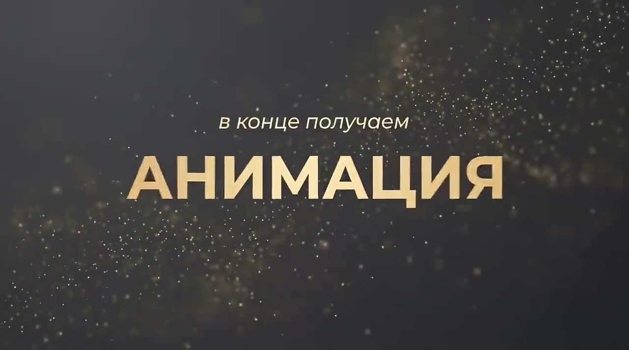
What it does
- Fires when a message starts with the word “animation” and carries timed captions — SRT, VTT or a plain list, it does not care.
- Reads every phrase for meaning and decides what belongs on screen under those words: a hero word filling the frame, an icon that matches, a giant number, a yes/no split, a timeline of stages.
- Hands back two prompts. One for Nano Banana 2: a sheet of storyboard panels. One for Gemini Omni Flash: your clip animated to follow that sheet.
- Seven palettes to pick from — graphite and gold, yellow on black, red alert and four more — and two orientations, 9:16 and 16:9, each with its own safe zone.
- Holds the rules these generators break on their own: nobody on screen, one text block per panel, six panels at most, colours named in words rather than hex.
Why you'd want it
A generator handed nothing but the script inserts a talking head, clones captions and scatters elements into corners for no reason. Here every word has a composition decided in advance, and the prohibitions are written into the prompt twice — once is not enough for the model to remember them. The safe zone is worked out too: the bottom third of a vertical frame belongs to the app interface, and text that lands there is read by nobody.
Where to put it
- 1Create the folder .claude/skills/grafika-director in your project
- 2Put a SKILL.md file in it with the text below
- 3That's it. Claude Code loads the skill itself when a task matches the description
To make the skill available in every project rather than one, put it in ~/.claude/skills instead of the project folder.
SKILL.md file
---
name: grafika-director
description: Turns timed captions (subtitles with timestamps) for a short VOICE-OVER-ONLY video (up to 10 seconds) into a ready motion-design storyboard for Nano Banana 2 and an animation prompt for Gemini Omni Flash — NO person on screen, pure voice-over motion graphics. Seven brand styles to choose from (asked in two short rounds — category, then specific style — see Step 0 and the palette table in Step 2b), plus a choice of vertical (9:16) or horizontal (16:9) orientation with matching safe-zone rules (see Step 2a). MUST activate this skill when the user's message starts with the word "animation" and includes captions or subtitles with timecodes. The skill analyzes the meaning of each phrase, invents a logical sequence of compositions and infographics to match the words, and outputs two ready-to-use prompts — one for generating a storyboard reference image, the other for animating that storyboard onto real footage in Omni Flash.
---

# Grafika Director — voice-over motion-design storyboard generator for timed captions

## What this skill does

The user sends timed captions for a short voice-over video (up to 10 seconds), with timestamps. This is often one part of a series of short videos on one topic (each ~10 sec, later stitched together). **There is no person on screen** in this video — only a voice-over and clean motion graphics on screen. The skill:

1. Asks a short round of setup questions (see Step 0)
2. Analyzes the text by meaning and timing
3. Invents a logical storyboard — which composition/infographic/number/diagram should appear under which words
4. Outputs a prompt for **Nano Banana 2** — generating a storyboard reference image (one sheet with panels)
5. Outputs a prompt for **Gemini Omni Flash** — animating the user's video according to that storyboard

This is a focused, lightweight mode: always pure voice-over (never a speaker on screen), a fixed set of styles to pick from. No talking heads, no headshot circles, no speaker-side-panels, no kinetic captions over a face — none of that exists here at all.

## Trigger

Activates when a message starts with the word **"animation"** and contains timed captions (text with timestamps, in any format — SRT, VTT, or a plain list of phrases with times).

## Step 0 — Mandatory questions before starting (ALWAYS ASK)

Unlike the rest of the skill's logic (where there should be no questions), these questions must ALWAYS be asked at the start of every run, right after receiving the captions, BEFORE any analysis or prompt output begins. If the user has already answered any of these earlier in the conversation, don't ask it again — only ask what's still missing.

The style question is split into two rounds because the interactive question tool caps out at 4 options per question, and there are 7 style presets — trying to cram them into one question would silently drop three of them.

**Round 1 — ask together via ask_user_input_v0 in a single call, single_select each:**

- **Question 1 — Which style category?**
  - **"Premium palettes"** (Graphite + Warm Gold, Ultraviolet, Emerald Editorial, Ice Blue)
  - **"Energetic palettes"** (Yellow-Black, Coral Punch, Mono Red Alert)
  - (the user may also skip this and reply directly with a specific style name, their own custom colors, or a reference image)

- **Question 2 — Orientation?**
  - **"Vertical (9:16)"** — Reels / Shorts / TikTok, phone mockups, bottom 30% safe zone
  - **"Horizontal (16:9)"** — YouTube / landscape, no phone mockups, different safe-zone rules (see Step 2a)

- **Question 3 — Is this a standalone video or part of a series?**
  - **"Standalone video"**
  - **"Part of a series — I'll specify which"** (in this case account for the part number so the storyboard doesn't repeat the composition sequence of neighboring parts when stitched together — see the rotation rule below).

**Round 2 — after Question 1's answer, ask ONE follow-up via ask_user_input_v0, single_select, showing only the styles inside the chosen category:**

- If **"Premium palettes"**: Graphite + Warm Gold / Ultraviolet / Emerald Editorial / Ice Blue
- If **"Energetic palettes"**: Yellow-Black / Coral Punch / Mono Red Alert

If the user directly named a specific style in Round 1 instead of picking a category, skip Round 2 entirely.

After all answers are collected, move straight to the full output with no further clarifying questions (the "no extra questions" rule from Step 1 applies starting from this point, not instead of these questions).

## Step 1 — Analyzing the captions

After Step 0, do NOT ask any more clarifying questions — go straight to the work and deliver both prompts. This is the core rule of the skill: minimum questions (only the mandatory setup round at the start), maximum ready-made output immediately.

Read all phrases in order with their timecodes. For EACH meaningful phrase (not each word — group by meaning) determine:

- **What should happen visually** during that time segment
- **The composition type** (see the library below — voice-over types only, no people)
- **The specific visual object** that illustrates exactly THESE words (not an abstraction — a concrete thing: a photo icon on the word "pictures", a checkmark/cross on a yes/no question, a chart on the word "charts", a digit on a number)

### Main rule for scene count (MAXIMUM 6, NO MORE)
No more than **1 composition change per 1.5–2 seconds of text**. For an 8–10 second video, the optimum is **5–6 panels**. NEVER more than 6 — proven in practice: 7–8 panels is too many, the storyboard becomes overloaded, and the Omni Flash animation stitches worse and gets confused. Fewer but more meaningful and denser editing is better.

### Rule: no word from the captions may be lost
When grouping an enumeration (e.g. "animation, infographics, and captions") into panels — EVERY word from the captions must appear as an on-screen caption somewhere, verbatim. If there are too many words to fit in one panel without overloading it with text — split the enumeration into 2 quick cascade panels (icon replaces icon, text replaces text) rather than dropping words for the sake of a cleaner prompt.

### Rule: the first 3 seconds of the video — maximum dynamism
No panel should "hang" for longer than ~1.5–2 seconds without a visual event change — especially at the start of the video, where the tightest editing is needed. If, based on caption timing, one meaningful block stretches over 3+ seconds within a single panel — split it into several quick cascade panels (alternating icons/accents within one theme) instead of holding one panel static for too long.

### Composition rotation across series parts (critical for multi-part projects)
If this is not a standalone video (established in Step 0) — NEVER repeat the same sequence of composition types used in the previous part of the same series. When parts are stitched into one longer video, the same choreography every 10 seconds reads as a noticeable loop-repeat.
- The first panel (opener) of a new part must be of a DIFFERENT type than the opener of the previous part (if the previous part opened with KEY WORD — this one should open with NUMBER HERO, or SPLIT, or TIMELINE, etc.)
- The overall order of composition types across the whole part should not match the previous part's order
- If you can't see what the previous part's storyboard looked like from the conversation context — ask briefly (this can be combined with the Step 0 questions), or make a reasonable decision based on the part number (part 1 = key-word-open, part 2 = number-open, part 3 = split-open, part 4 = timeline-open, and cycle from there)

### Composition type library (voice-over only, no people — proven in practice)

| Type | When to use |
|---|---|
| **FULLSCREEN KEY WORD** | Hook, climactic word, brand, honest moment — one hero word in caps filling the screen, soft glow in the accent color |
| **ICON CASCADE** | Enumeration of similar items (pictures → charts → text) — a card with an icon replaces a card with an icon, each under its own word |
| **NUMBER HERO** | Digits, percentages, deadlines, amounts — a giant number filling the frame, caption above it, a thin progress arc in the accent color |
| **SPLIT CHOICE** | A question with two options (yes/no, good/bad) — the screen splits into two halves with opposite symbols, one active (accent color), the other dimmed (grey) |
| **TIMELINE / PROGRESS** | Stages, steps, payment plan, deadlines — a horizontal timeline with stage dots, a running progress fill under the voice-over |
| **FULLSCREEN CONTENT / DIAGRAM** | A diagram, process, comparison, interface — full-screen infographic/diagram, no speaker |

There is no speaker, headshot circle, top-split with a person, or kinetic captions over a face in this skill — they're intentionally excluded from the library.

### Hard rule: NO panel may be text-only
Every single panel must contain at least one concrete visual object — an icon, a number, a symbol, a shape, a diagram, a progress element — beyond the caption text itself. A panel that is just enlarged caption text with no accompanying object is a failure, even if it technically uses one of the composition types above (e.g. a "FULLSCREEN KEY WORD" panel still needs the glow/particle/arc treatment around the word — the word alone, styled as a title card, is not enough).

If a phrase feels abstract and no obvious icon comes to mind, do NOT default to text-only. Use one of these fallbacks instead, in order of preference:
1. **A metaphor icon** — find the closest concrete object for the abstract idea (e.g. "trust" → a handshake or checkmark-in-shield icon; "process" → a gear or flowing-arrow icon; "growth" → an upward arrow or ascending-bars icon; "honest" → an open-eye or checkmark icon)
2. **NUMBER HERO** — if any quantifiable idea is nearby in the sentence (a count, a percentage, an implied ranking), pull it forward as a giant number even if it wasn't the literal focus of the phrase
3. **A structural device** — SPLIT CHOICE for any contrast or either/or framing, TIMELINE for any sequence or progression, even if the phrase doesn't name explicit steps

Before finalizing the storyboard, check every panel against this rule: if more than 1 out of the total panels would read as "just text," go back and apply a fallback to the weakest ones. This check happens silently as part of the analysis — do not skip it under time pressure to deliver quickly.

### Rules for good composition (learned from mistakes)
- **Main anchor: NO people in ANY panel.** Explicitly write in the prompt `NO people, NO presenter, NO faces, NO silhouettes anywhere in any panel — pure motion graphics only`. Otherwise the generator tends to insert a talking head.
- Safe zone: **all content must stay within the top 70% of the screen**, the bottom 30% always empty (Instagram UI eats into the bottom)
- If using a repeating element (e.g. the same card or number field across several consecutive panels) — **keep it in the SAME position** across all those panels; only the content inside changes, not the frame itself
- No chaotic movement of an element to random corners — every position must be justified by logic (e.g.: the main idea = center/fullscreen, a choice = split, stages = timeline bottom-to-top of frame)
- Don't write specific hex color codes inside the text that should appear ON the image (like "#C6A461") — the generator sometimes renders the code as literal text. Name the color in words ("warm gold", "lemon yellow").

### Text-on-panel rule (fixes text-duplication bug)
All text on a panel must live in ONE zone only — either top only, or center only. Never "text at top + text also in the center + a caption at the bottom" simultaneously on one panel — that kind of spread across zones makes the generator clone the caption. Explicitly write: "one single caption block in the TOP zone only" or "hero word centered, small caption directly above it, nothing else".

## Step 2a — Orientation rules (vertical vs horizontal)

The orientation chosen in Step 0 changes the safe zone, the mockup style, and the aspect ratio in both prompts. Everything else (panel logic, palette, dynamics layer) stays identical.

### Vertical (9:16) — default, Reels/Shorts/TikTok
- `aspect_ratio: "9:16"`
- Mockups: iPhone 14 Pro mockups in a grid
- Safe zone: **all content in the top 70% of the screen, bottom 30% always empty** (mobile app UI — caption, like/share icons, comment field — covers the bottom of the frame)

### Horizontal (16:9) — YouTube / landscape
- `aspect_ratio: "16:9"`
- Mockups: no phone mockups — use a clean flat canvas per panel (like a slide or a desktop/browser frame), since a widescreen frame doesn't read as a phone screen
- Safe zone: **all content in the center 80% of the frame, left/right 10% margins always empty, bottom 15% always empty** (landscape platforms typically overlay a title-safe strip along the bottom and sometimes a progress bar or channel watermark in a corner — the wider frame also needs side margins so text doesn't crowd the edges)
- Panel layout: since the frame is wider than tall, panels can use a horizontal split (e.g. hero word left, supporting icon/number right) instead of stacking everything centered — but keep to ONE caption zone per panel as usual (see the text-on-panel rule above)

## Step 2b — Style palette table (strict)

Each style follows the same structure: **background**, **single accent color**, **connective/caption text color**, and a **texture note** describing the premium/energy character of that palette. When building prompts (Step 3–4), substitute these four values into the reference template — everything else about the panel structure and dynamics layer (Step 5) stays identical across styles.

| # | Style name | Background | Accent (single color) | Connective text | Texture note |
|---|---|---|---|---|---|
| 1 | **Graphite + Warm Gold** | deep graphite `#0E0E10` (not pure black — warmer, more premium) | warm gold `#C6A461` | cream white | soft warm glow around gold elements, faint gold particle dust drifting in the air, thin gold card borders |
| 2 | **Yellow-Black** | pure jet black `#000000` | bright lemon yellow `#F2E400` | clean white | sharper and more energetic than graphite — hard yellow pills, thick yellow underlines, bright glow, punchier content rhythm |
| 3 | **Ice Blue** | dark navy graphite `#0A0E14` | cool ice blue `#5EC8FF` | cool white | crisp tech/fintech mood — thin glass-like highlights, subtle cyan glow, clean geometric lines, no particle dust |
| 4 | **Emerald Editorial** | near-black with a green undertone `#0D1210` | emerald green `#3ECF8E` | soft white | calm, expert, editorial mood — thin emerald borders, gentle glow, minimal texture, no particles |
| 5 | **Coral Punch** | neutral black `#141414` | coral orange `#FF6B4A` | warm white | warmer and more human than yellow-black — soft coral glow, rounded pill shapes, energetic but not harsh |
| 6 | **Ultraviolet** | deep violet-black `#12081C` | soft lilac `#B47CFF` | pale lavender white | premium but younger than gold — faint violet particle drift, soft glow, thin lilac borders, tech/creative mood |
| 7 | **Mono Red Alert** | near-black `#0E0E0E` | saturated red `#E8402C` | clean white | urgent, high-alert mood — sharp red pills, no glow softness, hard edges, use for "important/urgent" content only |

Dimmed/inactive elements are always dark grey (`dimmed grey`) in every style — NEVER red (except in Mono Red Alert, where red is the primary accent, not a warning color).

All seven styles share the SAME panel structure and dynamics layer (Step 5) — only the palette changes. Dynamic elements (accent circles, timelines, masks, glows) are tinted in the accent color of whichever style is selected.

## Step 3 — Nano Banana 2 prompt (REFERENCE WORKING FORMAT)

This is the EXACT working format. Copy this structure one-to-one, changing only the panel content to match the new captions and substituting the values from the Step 2b palette table for the selected style and the Step 2a rules for the selected orientation. Maximum 6 panels (see rule above). Do NOT simplify, do NOT drop details (arrows, badge numbers, timestamps, safe zone). Below is the reference in the Graphite + Warm Gold palette, vertical orientation — to use a different style, substitute the four values from the Step 2b table (`background`, `accent`, `connective text`, and drop the particle-dust texture note if the chosen style's texture note doesn't include one); to use horizontal orientation, substitute the mockup/safe-zone lines per Step 2a:

```json
{
  "prompt": "Premium motion design storyboard, [BACKGROUND] everywhere, [ACCENT COLOR] accents only, no other colors, no lines no markers. Bold [CONNECTIVE TEXT COLOR] title '[TITLE] — [X] SEC' with a thin [accent]-colored underline. [N] iPhone 14 Pro mockups in a clean grid, dark bezels matching the background, small [accent]-colored circle number badges (for horizontal orientation: replace with [N] flat widescreen canvas panels in a clean grid, no phone bezels, small [accent]-colored circle number badges). NO people, NO presenter, NO faces, NO silhouettes anywhere in any panel — pure motion graphics only. All content in top 70% of each phone, bottom 30% always empty (for horizontal orientation: all content in the center 80% of each panel, left/right 10% margins always empty, bottom 15% always empty). Panel 1 ([timing] FULLSCREEN KEY WORD): background screen, small italic '[connective word]' directly above, MASSIVE bold [accent] '[HERO WORD]' centered with soft glow, [texture note if applicable], nothing in lower half. Panel 2 ([timing] ICON CASCADE): background screen, accent-colored pill '[phrase]' top, large rounded card with thin accent border showing [specific icon matching the meaning] in accent-colored line style, NO people, NO faces. Panel 3 ([timing] NUMBER HERO): background screen, giant accent-colored number '[number]' centered filling frame, caption '[phrase]' directly above it, thin accent-colored progress arc around the number. Panel 4 ([timing] SPLIT CHOICE): background screen split into two halves, left side accent-colored [yes-symbol] glowing, right side dimmed grey [no-symbol], captions under each symbol. Panel 5 ([timing] TIMELINE): background screen, horizontal accent-colored timeline across middle with three step dots '[stage1] → [stage2] → [stage3]', accent-colored progress fill, caption top. Panel 6 ([timing] FULLSCREEN KEY WORD): background screen, small '[word]' above, bold accent-colored '[HERO WORD].' centered with glow holding gently, nothing in lower half. Timing stamps under panels in accent color. Thin accent-colored arrows between panels. [BACKGROUND] everywhere, [ACCENT COLOR] accents only, NO people anywhere.",
  "aspect_ratio": "9:16 (or 16:9 for horizontal orientation)",
  "layout": "storyboard_grid",
  "panels": "[N, maximum 6]",
  "consistency": "[BACKGROUND] background, [ACCENT COLOR] accents only, NO people/faces/presenter/silhouettes anywhere, safe zone per selected orientation (bottom 30% empty for vertical; center 80% with 10% side margins and bottom 15% empty for horizontal), every spoken word present as a caption somewhere, one caption zone per panel, pure voice-over motion graphics"
}
```

MANDATORY details of this format (do not drop):
- `NO people, NO presenter, NO faces, NO silhouettes anywhere in any panel` — repeated both in the prompt and in consistency (double redundancy keeps the voice-over-only rule enforced)
- `[N] circle number badges` in the accent color — panel numbers
- exact timing from the captions on every panel
- the full verbatim text of the user's phrases in quotes, exactly as in the captions — no word lost
- a specific icon matching the meaning of the word (for "comments" — comment bubble icon, for "charts" — bar chart, for "pictures" — photo gallery icon), in accent-colored line-style
- the correct safe zone for the selected orientation (see Step 2a) — never mix vertical and horizontal safe-zone rules in the same prompt
- `one single caption block` in one zone per panel (fixes text duplication)
- numbers/percentages/deadlines — always through NUMBER HERO, large — these are the main visual anchors of a voice-over video
- do NOT use `SLOW PUSH IN` / close-up on a face — there is no face here, camera dynamism comes through parallax layer drift and element morphing instead

## Step 4 — Gemini Omni Flash prompt (REFERENCE FORMULA)

This is the second prompt, which the user will paste in together with their video + the generated storyboard image to get the finished animation. Build it strictly following this formula. **The hard voice-over anchor goes at the VERY START** — otherwise Omni tends to insert a talking head.

```
Edit this video into a full-screen motion-graphics sequence following the attached storyboard reference exactly. NO people, NO presenter, NO talking head anywhere — this is a voice-over only sequence, pure motion graphics on screen. [BACKGROUND], [ACCENT COLOR] accents only. Smooth elegant transitions throughout, no hard cuts, everything morphs fluidly. Something is ALWAYS moving inside every segment — nothing ever freezes or holds static, and the very first second is already full of motion.

At 0:00 — background screen, small italic "[connective word]" fades in above, massive bold [accent] "[HERO WORD]" scales up center with overshoot and a soft glow pulse, [texture note if applicable].

At [timing 2] — the hero word dissolves, a rounded card with a thin accent border scales up from center showing [icon] in accent-colored line style, accent-colored pill "[phrase]" slides down into place.

[... for each timecode in the captions ...]

At [last timing] — everything dissolves back to the background, bold accent-colored "[final word]" scales up center with glow, holds gently glowing until the end with a slow subtle inward drift, never freezing completely.

Do not change the timing, speed, or duration of the original video. Keep the exact same frame rate and length, frame by frame — never retime anything. All transitions smooth and fluid. All text animates in with overshoot — never static. Premium cinematic motion. Keep my original audio exactly as it is.
```

For each style, substitute the first palette line and drop or keep the texture note per the Step 2 table (e.g. for Yellow-Black: `Pure black background, bright lemon yellow accents only.` with no particle dust; for Ultraviolet: `Deep violet-black background, soft lilac accents only.` with faint violet particle drift; for Mono Red Alert: `Near-black background, saturated red accents only.` with no glow softness, hard edges).

### REFERENCE OUTPUT EXAMPLE (Graphite + Warm Gold, voice-over, sample captions):

```
Edit this video into a full-screen motion-graphics sequence following the attached storyboard reference exactly. NO people, NO presenter, NO talking head anywhere — this is a voice-over only sequence, pure motion graphics on screen. Deep graphite background, warm gold accents only. Smooth elegant transitions throughout, no hard cuts, everything morphs fluidly.

At 0:00 — graphite screen, small cream italic "total" fades in above, massive bold gold "THREE STEPS" scales up center with overshoot and a soft warm glow pulse, faint gold particle dust drifts.

At 1.4s — the hero word dissolves, a horizontal gold timeline sweeps in across the middle, three step dots pop in one by one "choice → contract → keys", gold progress fills to the first dot.

At 3.6s — timeline dissolves, a giant gold number "30%" scales up center with a thin gold arc drawing around it, cream caption "first payment" fades in directly above.

At 5.2s — number morphs into a rounded card with thin gold border showing a gold key icon, gold pill "remainder on schedule" slides down into place.

At 7.0s — everything dissolves back to graphite, bold gold "NO MARKUP." scales up center with warm glow, holds gently glowing until the end with a slow subtle inward drift, never freezing completely.

Do not change the timing, speed, or duration of the original video. Keep the exact same frame rate and length, frame by frame — never retime anything. All transitions smooth and fluid. All text animates in with overshoot — never static. Premium cinematic motion. Keep my original audio exactly as it is.
```

### Key rules (learned in practice)
- Transition verbs: `morphs into`, `dissolves`, `fades`, `scales up`, `slides down into place`, `sweeps in`, `snaps in`, `rockets upward`, `draws around` — never plain "switches to" or "cuts to"
- Every text entry needs a specific verb (pops in with overshoot / slides in from left / scales up / snaps in) — never a bare "appears"
- Always end with: `Keep my original audio exactly as it is.`
- **No gap between timecodes should exceed ~2 seconds without an internal sub-event** — if the storyboard has a longer gap, add intermediate sub-timecodes with a new visual event inside the same panel (icon swap, layers doing a parallax drift, an arc drawing itself in, a number ticking up), otherwise the animation "sags" and looks frozen in the middle.
- **The first 3 seconds of the video are the densest**: at least 2–3 separate events in that window.

### Lessons from real-world use

**Anti-desync (critical — graphics run over footage with voice-over audio).** Omni retimes the frame during processing, and the original voice drifts out of sync. `Keep my original audio` preserves the sound but doesn't preserve sync. Reinforce the final line of the prompt with: `Do not change the timing, speed, or duration of the original video. Keep the exact same frame rate and length, frame by frame — never retime anything.` And in editing, lock it down: always keep the original audio track, mute the generated clip's track, and if the length has drifted — Retime → Change Speed to match the original's length. Omni isn't a lip-sync model, and there's no face here anyway — matching the big graphic accents to the key words of the voice-over is enough.

**Voice-over anchor — at the very start AND in consistency.** Always the first line of the Omni prompt: `NO people, NO presenter, NO talking head anywhere — this is a voice-over only sequence, pure motion graphics on screen.` Without this, Omni tends to generate a talking head over your footage. The same is duplicated in the Nano Banana prompt (`NO people ... anywhere`) — double prohibition in both.

**The video's ending = the last words of the captions.** Don't add panels after the last spoken phrase (a common mistake — tacking on an extra "brand" slide that isn't in the voice-over). The video ends exactly on the last words. Hold the last panel to the end with a light drift: `the final element holds gently glowing until the end, with a slow subtle inward drift, never freezing completely` — so the last second doesn't hang dead, but also doesn't distract from the final thought.

**Short runtime — fewer panels.** For 10 seconds, the optimum is 4–5 panels, no more. If the captions are short (2–3 meaningful blocks) — don't artificially split into 6 panels; instead give each number/hook more room and size. Numbers (30%, 70%, dates) are the main visual anchors — deliver them large through NUMBER HERO.

### Anti-moderation phrasing (MANDATORY, otherwise Omni/Nano Banana return "Error. Suspicious activity")
Proven in practice — the following phrasings trigger moderation, always replace them:
- ❌ `red X crossing out` / `red X strikes through` (a red cross reads as a prohibition sign) → ✅ `fades down as if switched off` / `softly dims` / `a dimmed grey icon` / `greyed-out`
- ❌ one long monolithic prompt with a dense stream of directives back to back → ✅ break it into clear paragraphs by timecode, don't overload a single sentence
- A close-up of a realistic face isn't relevant here (there is no face), but as a precaution avoid phrasing like `pushes in close to face`

## Step 5 — Dynamics layer (shared across all styles)

Dynamics are a separate layer, not tied to color. Pull these techniques into any of the seven styles, tinting elements in the accent color of the selected palette.

### Dynamics toolkit (pull in based on each panel's meaning)
- **Accent circle (not a headshot — purely graphic).** A round element with an icon/number inside appears top-center, content inside changes. Something inside is always moving. Never a face inside.
- **Timeline / progress bar.** A horizontal timeline with stage dots, a running progress fill, "step 1 → step 2 → step 3", filling in under the voice-over. Perfect for numbers, stages, deadlines (payment plan: 30% → 70% → date crawling along the timeline).
- **Mask transition (mask wipe / shape reveal).** A transition not via a cut but through a revealing shape: a circle mask opens from the center to reveal new content, a shape wipe, a diagonal curtain.
- **Element morphing.** A card morphs into a number, a number into an icon, everything dissolves into the background: `morphs into`, `dissolves`, `scales up`, `snaps in`. Never plain `cuts to`.
- **Element-to-element movement.** Content flies from point to point, numbers replace each other, an icon slides in and out.
- **Camera parallax.** A light parallax drift of layers, a slow push-in/pull-out between beats — so the frame never hangs static (this replaces a push-in on a face, which doesn't exist here).
- **Connectors.** Arrows, lines between elements, a dotted path — linking steps together.

### How to reflect this in the prompts
- In Nano Banana: add the needed dynamic element to a panel, tinted in the selected palette — `[accent]-colored timeline with step dots`, `circle with number inside`, `[accent]-colored circle-mask reveal shape`.
- In Omni Flash: describe the transition with a movement verb and constant internal motion — `the circle mask opens from center to reveal...`, `an [accent]-colored timeline bar fills up as...`, `the number morphs into an icon...`, `layers drift in slow parallax`.

### Style-mixing rule
- **Color** of elements (circles, timeline, masks, glow) = the accent of the selected palette (see Step 2 table).
- **Density:** something is ALWAYS moving; gaps >2 sec are broken up with sub-beats (the rule from Step 4 always applies).

## Step 6 — Final output (order of operations)

On every run of the skill:

1. **First**, ask the mandatory questions from Step 0 (style category → specific style, orientation, standalone video or part of a series), unless the answers are already known from the conversation context
2. After receiving the answers — deliver IMMEDIATELY, in one response, with no intermediate questions:
   - A very short text storyboard (timing → what happens), 1 line per panel
   - **The storyboard reference image prompt** — JSON format, ready to paste into Nano Banana 2 (or GPT Image if the user asks for that generator)
   - **The Gemini Omni Flash prompt** — ready text that the user will paste in together with their video + the generated storyboard image

Don't wait for the user to generate the image — deliver both prompts immediately in one response. The user generates the image and then the animation themselves; the skill always provides both prompts upfront.

Before delivering, run the no-text-only self-check from Step 1: every panel must have a concrete visual object beyond its caption. If a panel in the draft is text-only, apply a fallback and revise it — don't deliver a storyboard where multiple panels are just styled text.

## Response tone

No unnecessary theory — the user already knows all of this. Get straight to the point: a brief breakdown of the logic, then the ready-made prompts in code blocks. No "as you can see, I accounted for..." — just do it and show the result.